NOTE: I’m writing this on Saturday night, the 10th of December 2022, though I probably won’t post until next week. I’m just letting you know that date in case it becomes significant to someone, which will hopefully make more sense as you read.
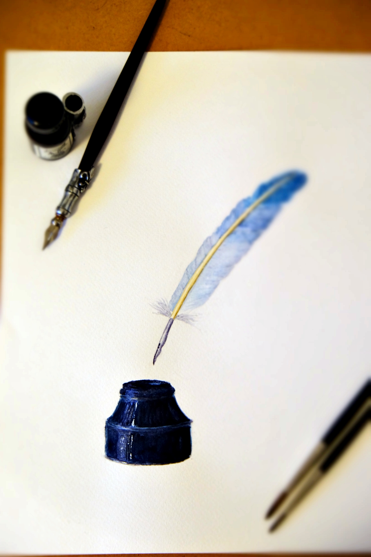
I woke up this morning with an image burned in my brain. It was so clear, it was as if I had opened my eyes to see a painting I had already done sitting in front of me, except that the image was the entire “screen” of my mind, like looking inside the camera viewfinder to a recently taken photo. I saw a feather turned into a quill floating over an inkwell, all in specific colours, on specific angles, and all with a certain sense of weight about it. I didn’t quite know what it meant but I knew I was meant to paint it. I have reason to wonder: is it a message meant for someone else? Is it meant for you?
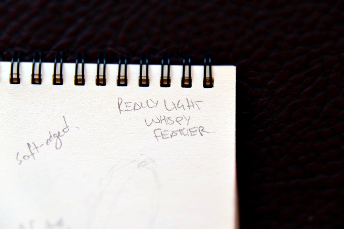
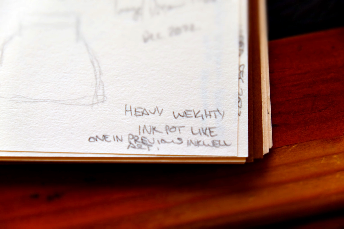
After the image came strongly into my mind, I got up straight away and very roughly sketched it out so that I wouldn’t forget it. It was the weight of the two parts of the image that really impressed upon me when I saw the image strongly in my mind. I wrote in scrawly, hurried capital letters at the top of my small sketchbook page: “REALLY LIGHT WHISPY FEATHER” and wrote in capital letters at the bottom of the page: “HEAVY WEIGHTY INK POT LIKE ONE IN PREVIOUS INKWELL ART.”
Later this morning I researched quill pens because I wanted to get the angle of the feather and the nib exactly right. I couldn’t quite go from memory because it was already fading a little but one thing was certain: I would know my feather when I saw it!
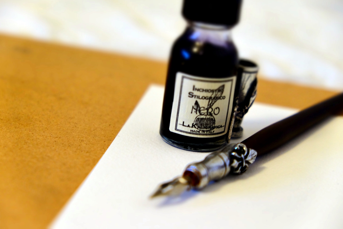
I already knew the inkwell. It was the exact inkwell I had painted in a different painting, hence the words “LIKE ONE IN PREVIOUS INKWELL ART” at the bottom of the sketchbook page. This one, however, was blue-black, not black like the one I had painted previously. So I dug out that painting and used it as my reference.
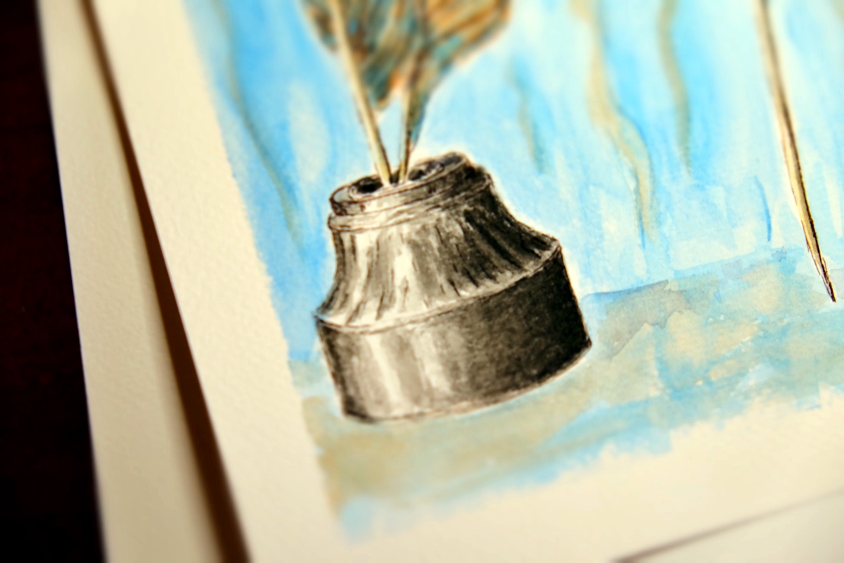
Here’s the key part of the reference image I used:
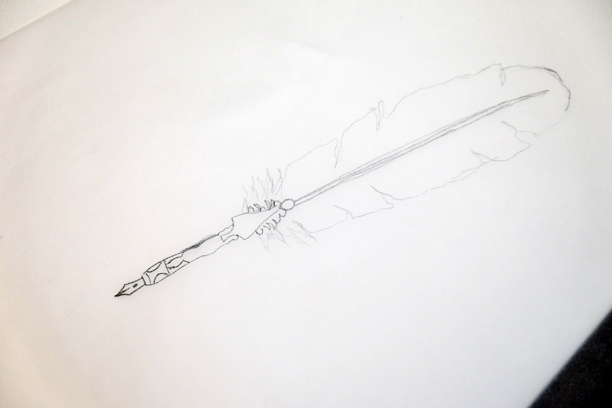
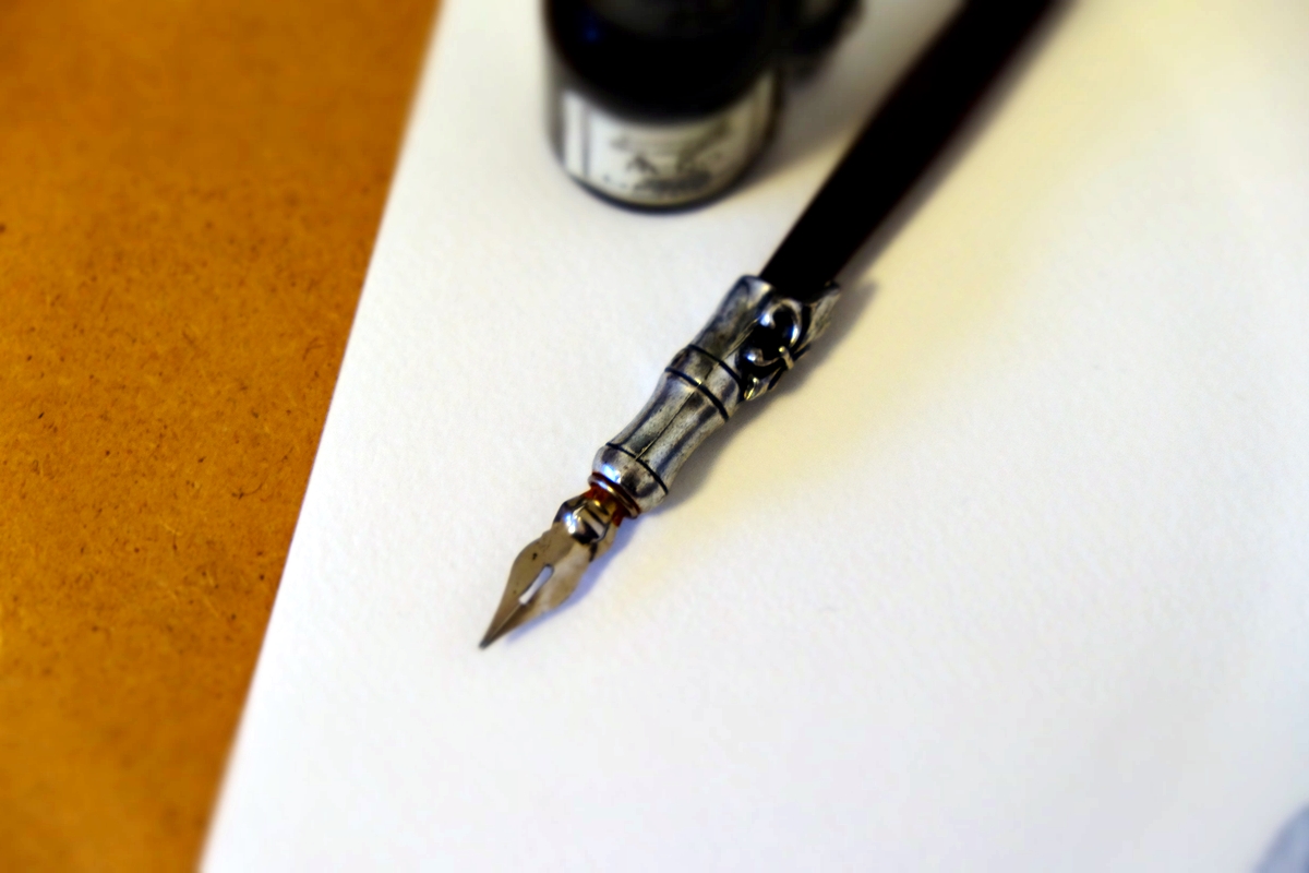
I looked at many quills with metal tips but none of them were my quill and none of them had the exact right angle I needed. My quill pen had a very plain nib, but every nib I saw was fancy and long like this one that I drew on tracing paper for a later piece and like the pen I already own:-
Did plain short metal nibs on feather dip pens even exist? About to give up and try to draw it solely from memory instead, I said to God, “If you want me to paint it, can you bring up a reference feather that has my nib?” I scrolled down one row further on the page of images I was looking at. The very next image was my feather, on the exact right angle, with the exact right curve, only … it was backwards – reversed – and completely white. It confirmed for me that I was meant to paint this image but not just copy what I saw; pair the reference with what was in my head. My feather was unique, special, and I needed to show it. God was providing me with a reference to springboard from, but not to just copy.
When I sat down to draw it later that morning, I drew each part on separate pieces of tracing paper because the positioning of the two mattered and I wanted to be able to overlay them to get them right before I drew the final image. The feather had a very distinct angle that showed it was about to be used imminently by the unseen writer. This aspect of the image was very important and my goal was to recreate the image as faithfully as I could.
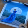
I then painted it in many layers throughout the day, waiting for each layer to reveal itself to me: the undertones, the highlights, the blends of feather colours. The result is a striking yet somehow delicate piece, strong and light, soft and sharp.
Not quite knowing what to call it, I have stuck with the first title that came to me: “The weight of words.”
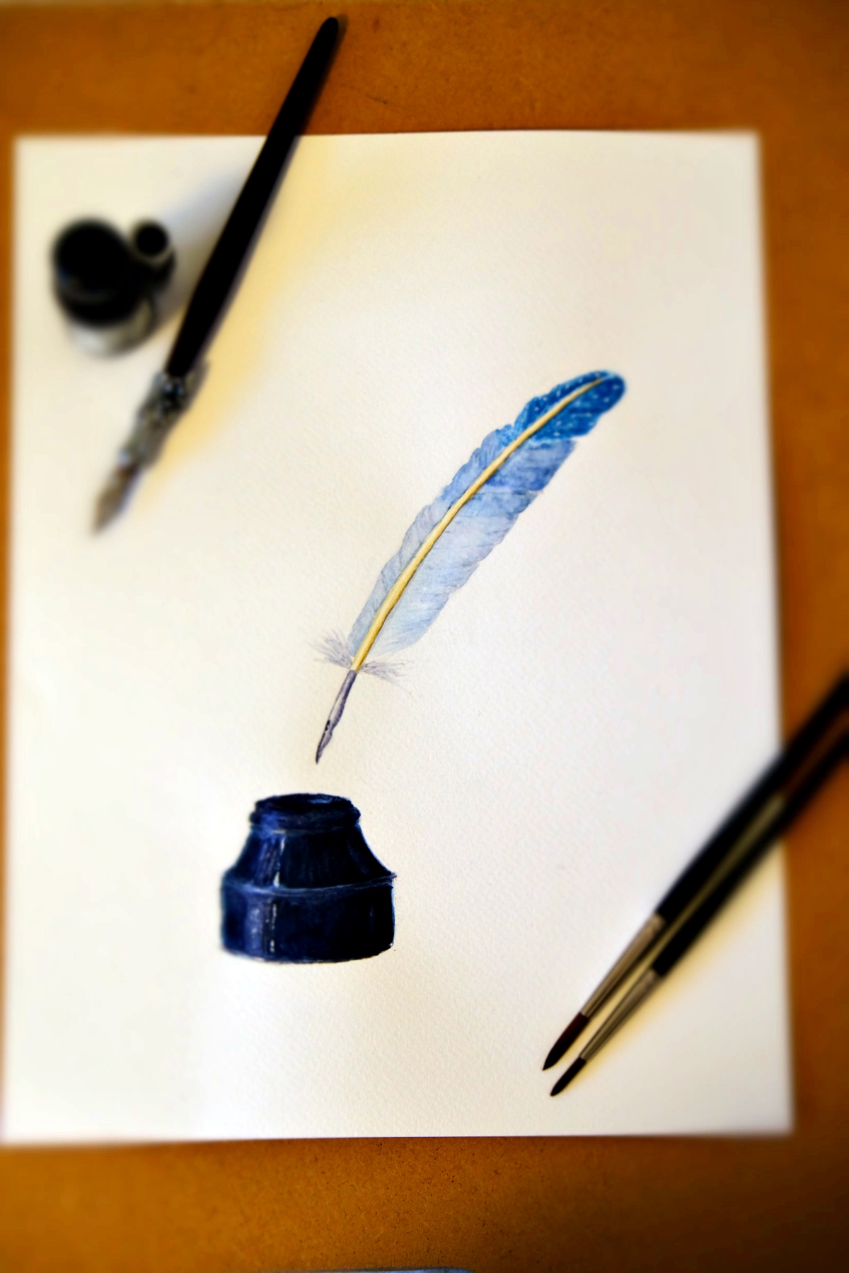
I knew, somehow, it was about words – whether it was the power of them, or something important that was about to be written. I say about to be written because the pen had not yet been dipped into the inkwell. As I said, the angle of the feather showed how imminently the quill was about to be used. The feather had a distinct angle and position that showed it was about to be dipped and used, not put back to rest. (I could be wrong, though. Perhaps it is about words that have been or are being written now? I am hoping someone knows.)
The feather was very light, very wispy. It floated. The lightness of it was what impressed me most. And it was being held by an unseen hand. Who was the unseen hand? I do not know. I can guess, but a guess is all it would be.
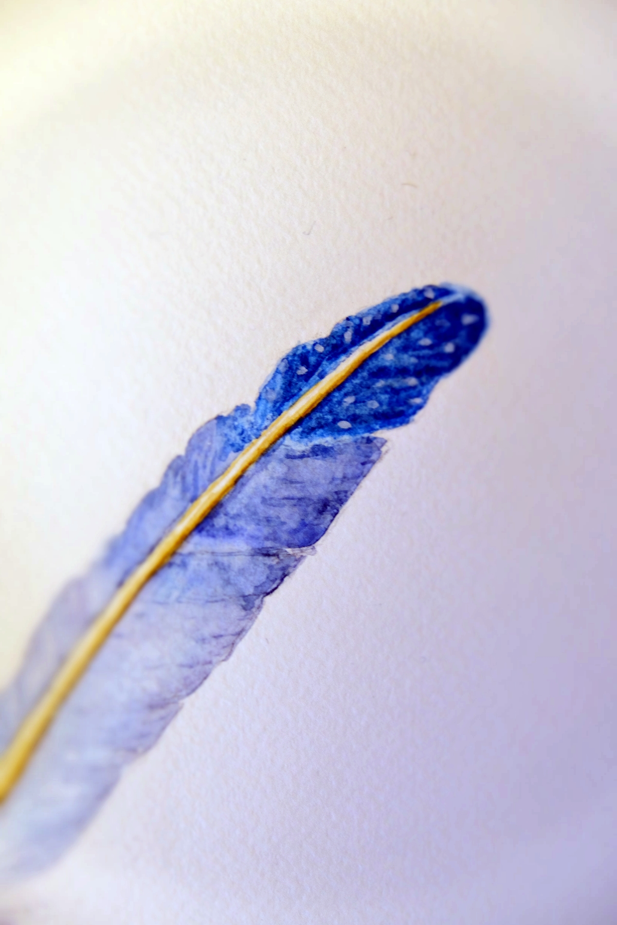
The top of the feather was a rich darker blue – a very particular blue that I tried to match – and as I painted it, I knew it had to have pale spots. Interestingly, I showed my husband the artwork earlier this evening. He didn’t know the story behind the painting. He didn’t know it had a “weight” of unknown meaning to it and that it burned into my brain in the seconds before opening my eyes this morning. It might just have been a nice feather and inkwell. Not all of my artwork has deeper metaphorical symbolism. The majority don’t, and he’s not one to go finding those kinds of things in art. But he immediately pointed to the top of the feather and said, “They are stars. I definitely see stars.” It’s odd because he didn’t ask: “Are they meant to be stars?” You would assume that I, as the artist, would know whether it was meant to be stars or not and a more natural response would be to ask. You don’t normally tell an artist what’s there despite their intentions. He didn’t know that I was unaware of the true meaning of this piece. I disagreed saying I think it is just a feather with spots. At that point, you would think a person would say, “Well, you’re the artist. If you didn’t paint stars, they’re not stars.” But he was adamant, and he still sticks to what he says: they were stars. I had to concede that maybe they are.
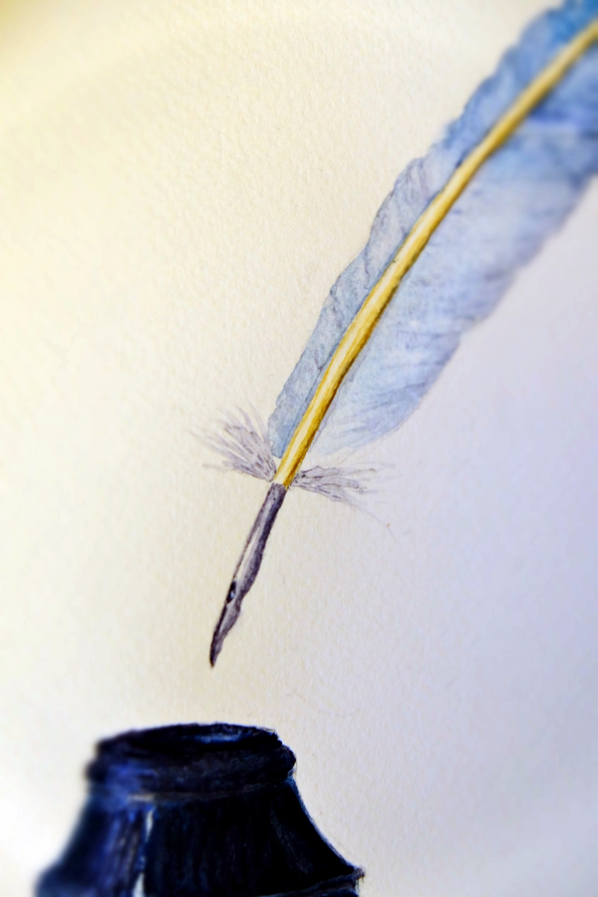
Turned on the angle that it was, the quill’s point looked very sharp. The softness of the feather, possibly representing the lightness of words, could also be very sharp, very pointed, or very ‘to the point’. And the inkwell had a strong presence to it: whatever was about to be penned in that dark ink was heavy, weighty. The colours of blue to the feather and blue-black to the inkwell showed me that the quill and the inkwell were a complimentary pair even though the feather was light and wispy, the tip sharp and the inkwell weighty and strong. Though there were opposites to this piece, nothing jarred. It all worked together as a perfect whole.
I’m not sure I fully understand this image yet and all that it is supposed to mean, but I knew I had to paint it faithfully, and so I did. This is new for me because normally I paint what I am trying to express or show. The meaning usually comes first. This time, the image came first; the meaning is yet to come, which makes me think it is an image meant for someone else. Perhaps it means something to someone or more than one of you? Or perhaps the image was for me and the meaning will become clear?
I don’t often turn on comments. I used to have comments on but all I was getting was horrible spam, but I’m going to leave it on for this.
If this image means something to you (and maybe the date), will you tell me below or write to me?
UPDATE: We believe we found the person the artwork and its message was intended for (although we’re not eliminating the possibility it was for more than one person). It was our absolute delight to send her a special edition print as a gift which we created specifically for her. In terms of products for sale, it may appear on a notebook in the future as it would certainly suit that, but we choose our notebooks organically, month-to-month, so we never know in advance what our notebooks will be.


I can’t say that it’s for me, cause I’m not 100% sure, but before I read the part about the stars, I knew those were stars. That could speak of eternal things, things “out of this world,” heavenly things. The deep blue could refer to depth and weight of the things to be written. As for the sharpness of the nib, the Word of God is sometimes compared to a sword. All of that being said, this seems to be for someone who is called to write some hefty God-given creative stuff.
I don’t know what significance the date has…
Honestly, considering how you received this, and what you have written here, I would consider purchasing something with this on it.
That’s quite extraordinary, Jennifer, that you see stars as well. Actually, the fact that I didn’t or don’t see stars kind of confirms that the piece isn’t for me. It would be quite amazing if the piece was actually for you. As I said, this is totally new for me. I chatted with Naomi via our virtual office yesterday and I said, “I wonder if this is a one-off or something God will use me for. He’ll give me the image and say, ‘Paint that, please’ and it’ll be significant to someone else for some reason. You never know.” I’m curious: do you have a calling to write God-given creative things? Or maybe this moment is the calling, or confirmation of the calling? I did wonder about the colour of the blue being eternal, having depth to it, especially if the white dots are stars. I just knew the colour… Read more »
Hi again Jennifer.
I’m planning on emailing you today, but I’m leaving a comment here just in case the email ends up in your junk mail folder.
We’ve created a special edition print of this just for you because we believe it’s meant for you and even if it isn’t, we really want you to have it. With your permission, we’ll send it to you totally free of charge.
Hopefully you will see this and/or the email we send and I can get your address. If you don’t get the email but you see this, are you happy to email me and I’ll explain further? (See the ‘Queries’ link under ‘More’ above for our email address.)