EDITOR’S NOTE: This post specifically mentions art, but the point of it is relevant to ALL forms of creativity. If you’re a creator and/or a consumer of creative things, then this post is for you.
I recently had a whole lot of art cliches levelled at me as someone gave “constructive” criticism for a large selection of my art. Someone who, I might add, isn’t an artist. Someone who claimed that they thought my art was great and really wanted to see my private collection of originals in person. So, in good faith, I showed them.
I believe in ‘horses for courses’ when it comes to art. I am perfectly okay if you come along to my website and you don’t like any of my art, or some pieces appeal to you and some don’t. There’s plenty of art pieces out there that I don’t like either. However, that doesn’t mean that any artwork I don’t like is bad. And that doesn’t mean, if you don’t like a piece I painted, that my art is bad.
I often hear people saying, after a reading a novel, something like, “That was a bad book.” To which I reply: “Was it badly written or did you just not like it?” Because they’re not the same thing. And neither is it the same thing with art. Is it badly done, or do you just not like it?
This person, who offered a totally uncalled-for and inappropriate critique of my art, was actually reacting to the fact that it wasn’t their preferred style. However, they interpreted their gut reaction as: “This is all wrong.” They hadn’t separated out their taste for technical ability. And it is a flaw at the very core of the rampant judgmentalism I see out there about all forms of art, from books to movies to paintings to woodworking to interior design to graphic design and even architecture.
I sat there in silence, taking in the barrage of supposedly helpful criticism, and each little dig and “helpful” comment rankled, but none so much as this one that just ‘gets my goat’:
“Less is more.“
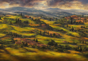
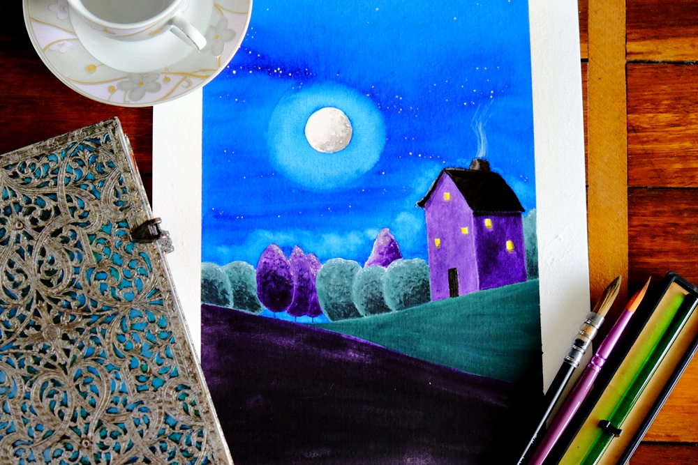
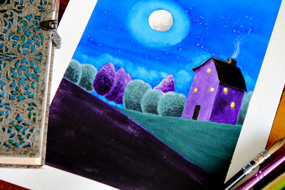
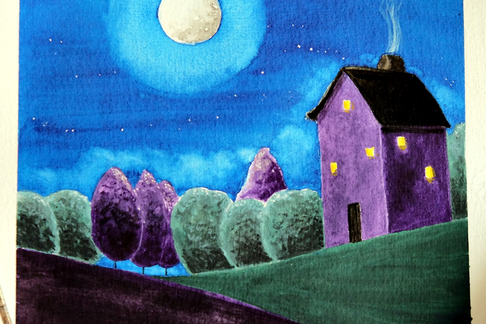
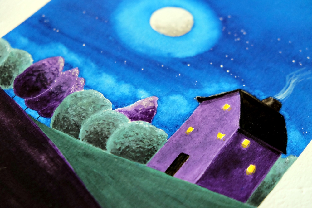
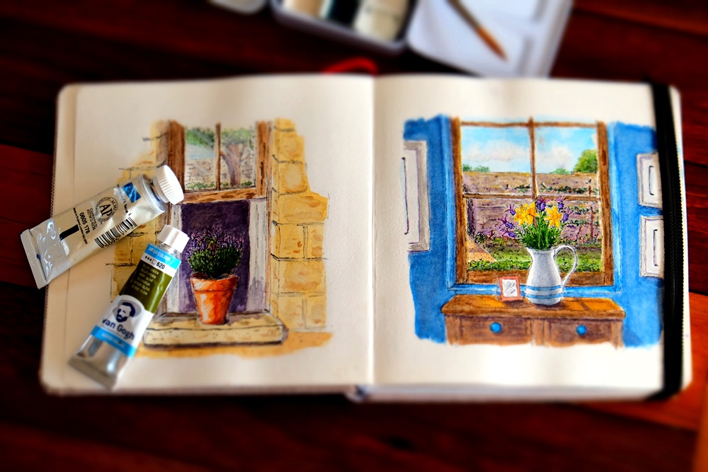
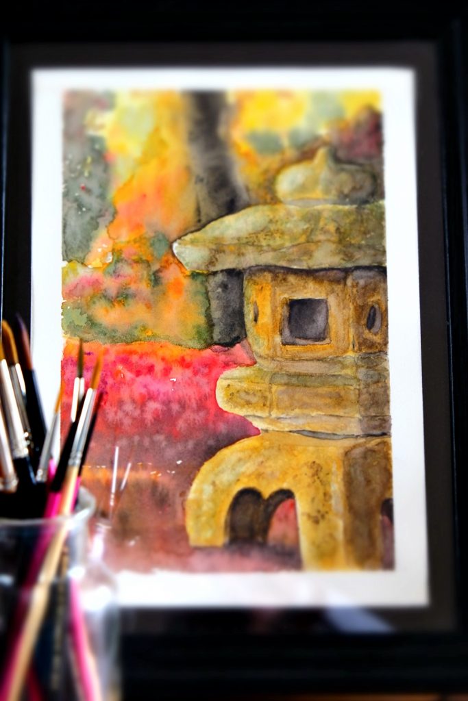
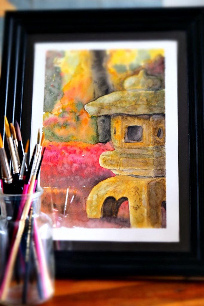
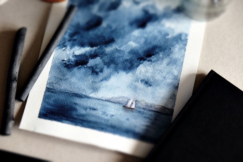
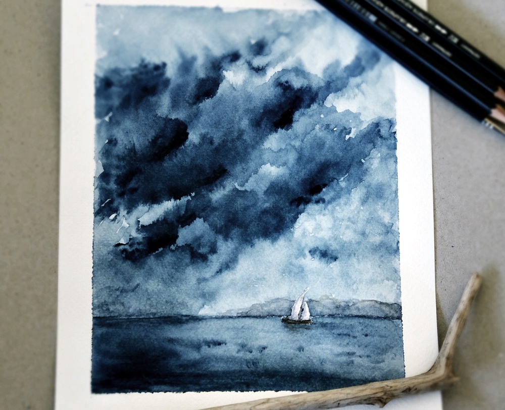
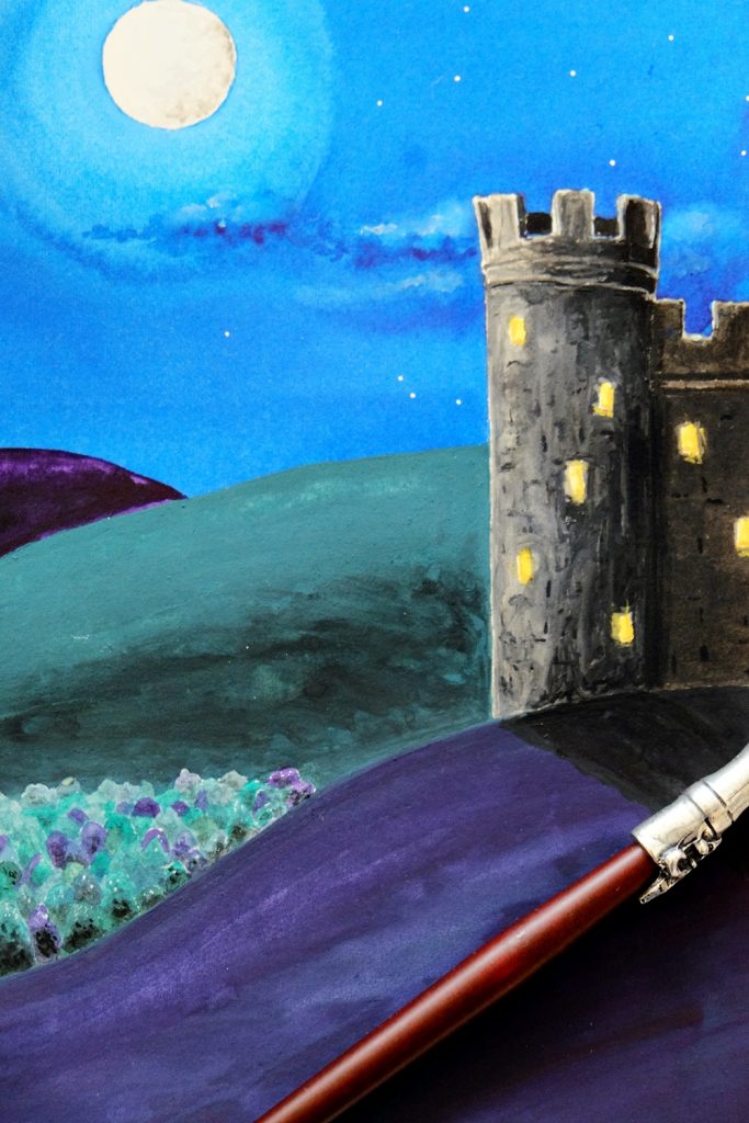
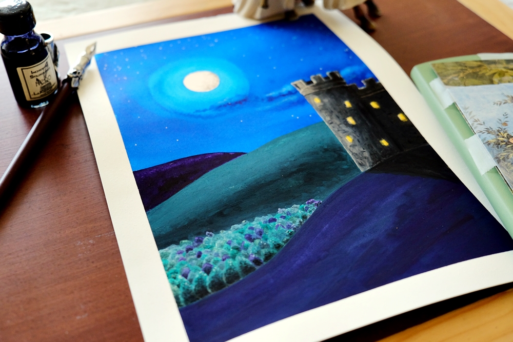
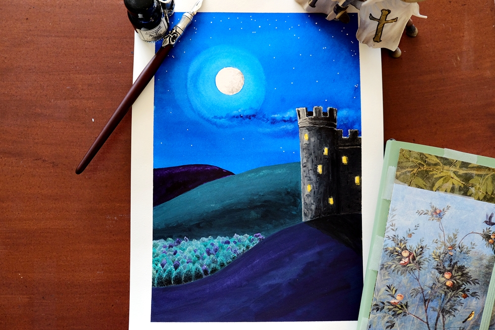
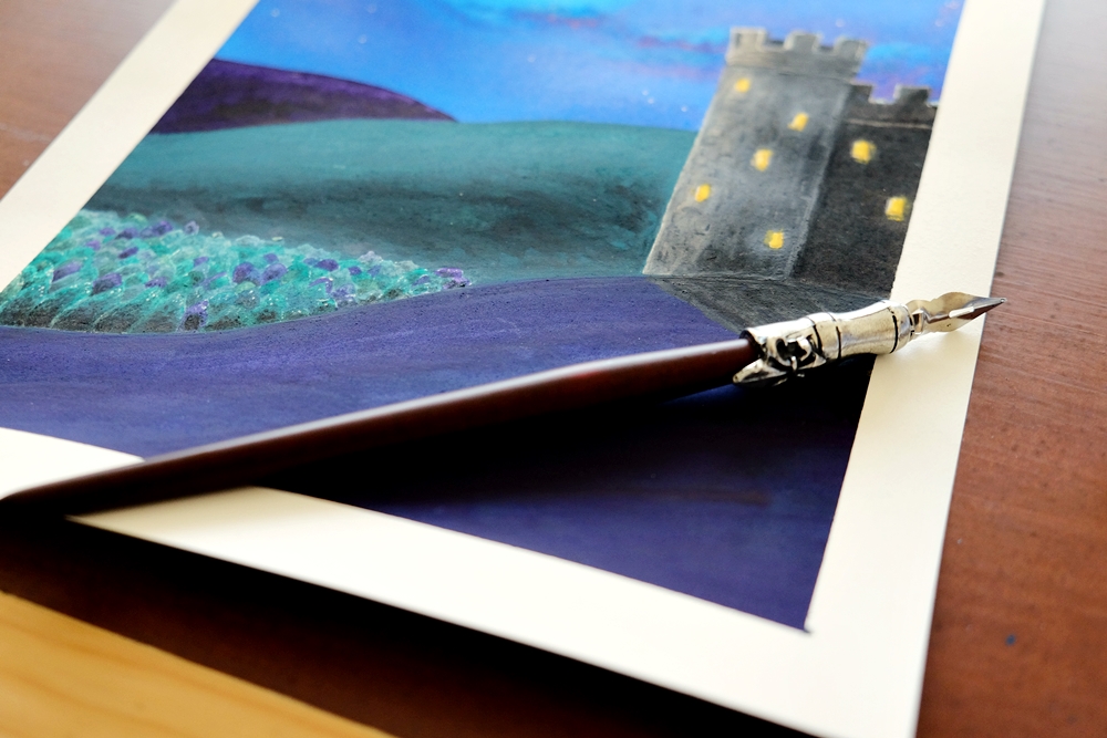
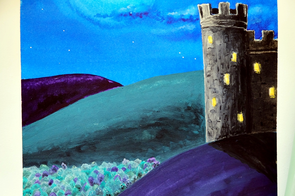
The comment was made after showing the person this painting below, which I declared was one of my favourites for the technical skill and detail in it that I felt surpassed what I thought I was capable of. I was told it wasn’t any good because “less is more”.
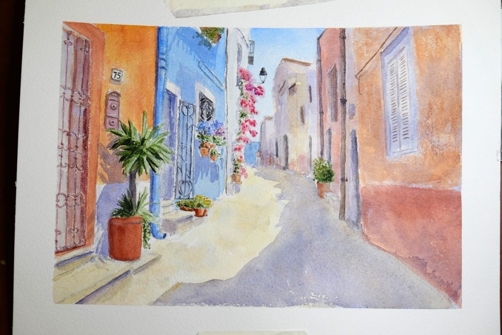
Really? Genuinely? Less is ALWAYS more? Because by saying that, that’s what this person meant. (If they hadn’t meant that, then logically there would be room for that piece of art above.) According to this cliche, anything that isn’t “less” is clearly not good enough.
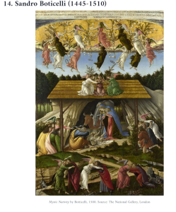
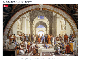
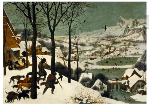
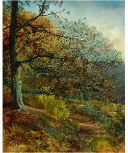
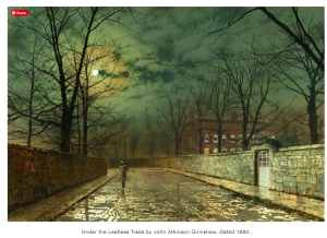
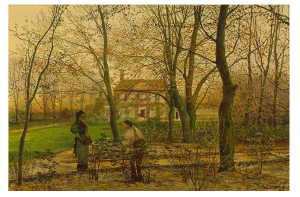
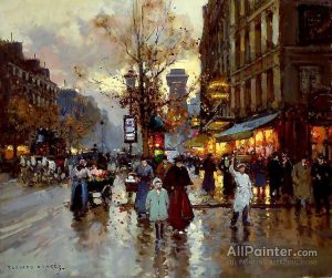
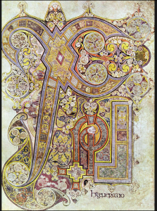
Let’s take a look at that logic, shall we? Try to imagine telling these artists (including some of my all-time favourites like Bruegel and Grimshore) that less is more. Click on an image to see all of that “more” that should apparently be “less”.
[I couldn’t find some of the artists’ names so I marked them as Artist Unknown. If the art is yours, I apologise.]
Why does it ‘get my goat’? Because this one cliche perfectly illustrates what I mean by a flaw in the logic of the way we offer judgements upon art: the flaw that makes us confuse taste for talent.
Instead, I would argue that like all art, when it comes to ‘less is more’, it depends. What are you trying to say? And how best should you say it? Or how do you want to say it? With beautiful, rich detail? With intricacy? With simplicity? With broad, sweeping strokes? With a limited palette of colours? With a childlike abandonment of colour choices? With realism or symbolism or both? With less? Or with more?
I’ve seen so many criticisms out there. I’ve seen people who think that loose and expressive watercolour is the only true type of watercolour for it shows that you’ve broken free from the tyranny of realism. Or that if you haven’t used the rule of thirds, it’s not a good painting. Or that mixed media on watercolour is cheating. Or that you shouldn’t use black paint in watercolour or oils: it’s not proper. That using white paint at the end of a watercolour instead of leaving the whites of the paper from the beginning, shows you don’t have enough skills yet. That oils and acrylics are the true medium for the serious artist, not watercolour. That watercolour paintings aren’t really worth what a good oil painting is. That graphite pencils should just be used for pre-art sketches, not completed art. That colouring in isn’t actually creative. That abstract art isn’t art. That folk art or illustrations aren’t really art. That digital artists aren’t proper artists.
I mean, honestly: where on earth do these “rules” come from? And who decided to scratch all the kinds of art that don’t comply?
Artists and art lovers, please! For the love of all that is creative, stop levelling your rules and cliches at artists. And as you consume art or anything in any creative field, try to separate out taste for talent. If you don’t like something, move on. Find something else you do love. Pursue what makes you come alive. But leave artists and creatives to create what makes them come alive.
And let’s all agree that when it comes to criticising, limiting and judging, in this at least, less is indeed more.
OVER TO YOU…
Have you had “constructive” criticism levelled at you for your creative endeavours or for your passions and dreams in life?
Feel free to offload some of the things said about you down below to a listening ear, or offer advice to the rest of us about how you rise above.














I’ve had some real doozies of “constructive” criticism and labels levelled at me in my life for all sorts of things. You can read about some of it in my article “You’re not a proper writer”. https://www.thelonelycreative.com/youre-not-a-proper-writer/
How about you? Have you ever struggled under the weight of someone else’s rules and subjective expectations? Did you find ways to rise above?
I think your critic must have failed at Where’s Wally books as a kid. These childhood failures can take their toll in adulthood. Maybe we should embark on a clean up campaign and say, remove the earring from the Girl with the Pearl Earring (Vermeer) she becomes the Girl Without the Pearl Earring. Simple. And while we are at it, remove a few trees from Constable’s landscapes and strip half a dozen blokes out of Rembrandt’s Night Watch. Or better still, just strip them down to their underwear. Might cut Macbeth’s three witches down to two, that’ll sort the dramatic world out as well. Then a quick edit, removing 46 of the 47 Hallelujahs in Handel’s Hallelujah Chorus and we are just about done.
“Snow White and the Two Dwarves”? I mean, let’s face it, the other five are probably superfluous.
“The Preacher Had Two Kids”? Quicker to write about, though a little more unremarkable.